This project was asked for by a client who wanted a microsite that they could send to other companies or potential clients to assist them in finding out if they are doing what is needed to reach net neutrality.
The site is a simple questionnaire with multiple end points where the user is provided with a PDF and information on how they can get to the next step and keep striving for net zero.
The site was specifically requested to be highly animated and engaging to be on.
Project objectives
- Create a website that can be traversed in under 5 minutes.
- Generate clients or at the very least interest users in finding out more about net zero.
- Make the website engaging to interact with.
- Implement analytics to check for bounce rate, problem pages and geographical information on where users are accessing and interacting with the site.
- Provide a solution for email campaigns and newsletters.
- Responsive design for multiple screen sizes.
- Small and optimized asset sizes to reduce loading times.
- Implement and consider the company's logo(s) and color(s) when designing the look and feel of the website.
These objectives outlined were requested and discussed between myself and the client. Some of the objectives showed up around the halfway mark, but for the sake of brevity I will discuss them as if they were all outlined at the start.
My role in the project
As the sole developer and designer of the project, a lot of communication, updates and questions were required on my end to make sure that I was doing everything to the clients expectation.
To get all of the administrative tasks out of the way first:
- I organized meetings to discuss how the project was coming along.
- Discussed methods and solutions with the statistics team on how best to implement analytics for their needs.
- Made sure to keep them in the loop when it comes to designing the look of the website using their corporate assets.
- Clearly stated the technologies I was planning on using, their pros and cons and how they will slot into the project's structure.
- Stated timelines and work that was to be done in those timelines (I'm surprised I managed to meet them, more on that later).
The design roles:
- Create and provide mockups, elements and assets to be reviewed and approved by the client.
- Create the mood and language to be used on the site. Always to be positive regardless of the stage, page or section.
- User journey and the flow through the website. Since the site is more or less linear, the flow was quickly agreed upon.
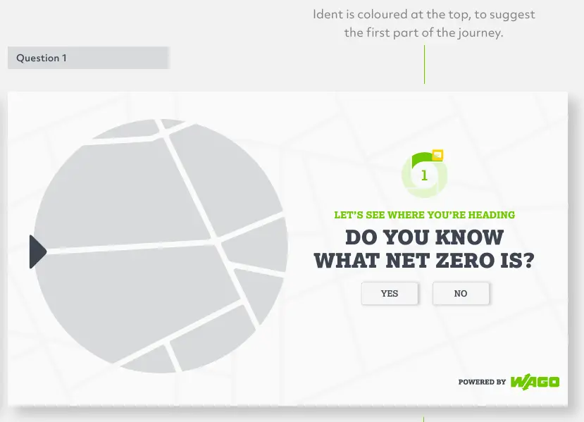
- Visually show the user that they are making their way through a journey. The project is called Road To Net Zero.
The development roles:
- Take the agreed upon design and implement it as an interactive website.
- Develop the site in stages to allow for testing, feedback and changes.
- Optimize and integrate assets that work with the design.
- Create form inputs to allow a user to sign up for the newsletter.
- Take care to adhere to the GDPR policies and rules.
- Version controls the project to allow for rollback.
Overall, it was a very involved process that I was happy to be able to take part in as it taught me a lot of things when it came to working with already established companies.
Technologies used
During the conversations, we discussed requirements for the site. There are many ways to implement solutions to these requirements which is why I find web development difficult; there's always a better and newer way. I tried my best to not go too far down any rabbit holes and focused on trying to find frameworks, libraries and software that ticked enough boxes and were tried and tested.
Front-end
- ReactJS: Used ReactJS to build web components, elements and layouts. Using the state management and event system to provide a smooth user experience.
- TSX: Used to build the components for the site. A type safe version of JSX; TSX allows me to create dynamic, discrete HTML components that have better error handling and log outputs.
- SCSS: The stylesheet language that I prefer to use over CSS, its syntax and structure is very similar to CSS but with the added benefit of nesting classes and a better variable system.
- LottieFiles: An animation file format that is high quality, interactive and editable at runtime. Based on vectors, the animations are not only small in size, but also scalable without loss in rendering quality.
- Framer-motion: An animation library that allows for easy to read and highly complex animations.
Back-end
Due to the requirements of the project, there was no need for any backend implementations. This was a good thing because I am still unsure with my ability to create secure and robust backend solutions. I've been learning quite a bit about backend ever since I did this project. My aim is to be able to do every step of web development on my own as I think it will help me: Be more independent and flexible when it comes to taking on future freelance jobs, and help me communicate and work better in a team if I decide to work for a company.
Others
- G4A: Google analytics to track if and where users were falling off, whether or not the home page was interesting and engaging enough to spur a user to start the questionnaire. Analytics were also used to determine if there was a pattern in geological interest.
- MailChimp: An all-in-one marketing platform that provides email marketing, marketing automation, and customer relationship management tools. In this project's case, it allowed the client to build and manage email campaigns and build subscriber lists.
- Illustrator and After Effects: Used to create the vector art and animate it.
Design and development
With this project being one of my first freelance jobs, it was surprising to me how much work outside of the actual creation of the website that goes on. I thought the longest part of the process was going to be the development cycle, but what was actually the longest was the design process.
Not being formally trained in any part of the project I had to really button it up the back and make sure I wasn't doing anything out of the ordinary. The amount of time spent making sure my processes and communication were up to standard was a very draining but educational part of the project.
Design
Designing the website started with taking what was already created by the company and using it as a base for creating the microsite. Being constrained and having boundaries in the form of existing design choices really helped with the design process as I couldn't try to shoehorn in style choices or aesthetics I feel comfortable with creating.
As the sole designer and developer of the site, being able to layout and plan in such a way that worked best for me was something I looked forward to being able to do. This ideal however was quickly overshadowed by the fact that I was going to have to create style guides for future designers or developers that may add to the project in the future. This realization was an eye opener to the benefits of writing, developing and designing like the project will be worked on by other people in the future.
Visual design
The company is already well established, so they had a lot of assets and design choices already taken care of. They did however ask that the website felt friendly and modern. This website was to be a showcase of how up to date and involved the company was regarding carbon emissions.
To illustrate my ideas and choices I will take snippets from the presentation I created during the design process.
Logo
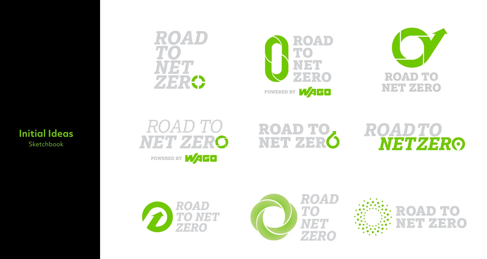
The first step was to create a logo that was adjacent to the current company's logo. They wanted something that felt green and sustainable. As you can see from the sketches, I tried my best to take this information and generate as many ideas as I could. The road to net zero type was always going to be present, however the icon was what was subject to change and suggestion.
In the end the client decided upon this one as a starting point for the design, it went through many iterations but the green circular icon created ended up being used in many different sections of the website.

Language
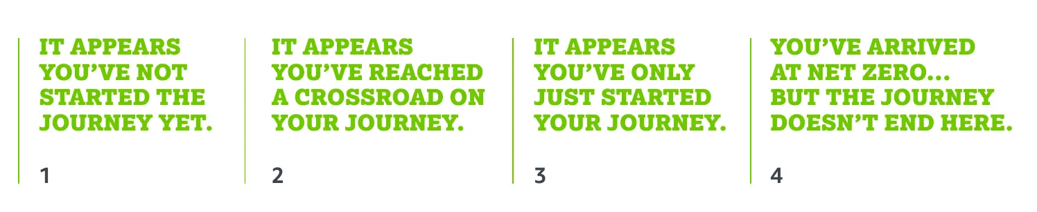
The language was very important on the site since there was not going to be a lot of it. The statements, questions and information all had to be to the point. After discussing with the client we agreed that the language had to be positive no matter the circumstance; the website has points where the user can answer a question incorrectly and end up partially through their journey to net zero. If this happens, the text should be encouraging and uplifting, not scolding or disappointing.
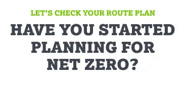
The questions were to be direct and simple, without any of the journey analogies sprinkled in. This allowed for the journey idea to be consistent with the progression through the questionnaire and not the actual questionnaire itself.
Layout and flow
During the preliminary discussions, the client spoke a lot about maps and navigation. When you want to go somewhere, you plan the journey out beforehand and find a route that is the quickest and easiest to get to the endpoint.
The idea agreed upon was to take the user from point A to B like they were on a road trip. A lot of the visual feedback ended up revolving around this concept as it was a great way to show progression.
Development
Building the website after all of this pre-planning and discussion had been completed greatly improved my workflow and development. It turns out having a blueprint of the final product makes decision making and problem solving a lot easier.
I had created websites before this project, but this one felt much different. I had to actually lay out what I was going to do and get it signed off before doing it. Every project before this one was a lot looser and undefined. It was a nice change.
Front-end
Taking each part of the preliminary designs and splitting them up into elements and components was the first step to creating the front-end. During this project I did not know of the concept of Atomic Design, so a lot of the components are not made up of smaller 'atoms'.
React
At the time of taking on this project I didn't have a lot of experience when it came to component-based architecture. This was an eye opening experience. Once you change your mindset and start breaking down pages into layouts, features, components and elements; it's difficult to go back to doing it any other way.
The amount of headaches caused by refactoring and updating are near zero since components that are used throughout the entire site only need to be modified once for the changes to take effect.
Since it was my first time using React, there was a learning period and a lot of refactored code to get it to a place I was happy.
Animations
The most difficult aspect of this project was the animations, since each element is a separate component, the animations had to be created individually and sequenced based on each other.
I'm not an animator so it took me quite a bit of time to figure out how all of this was going to work...
I decided to break the animations into two categories:
- Pre created or 'baked' animations
- Page layout animations
The baked animations were complex and detailed, let's take the 'Road To Net Zero' text as an example. The main icon is shown in the beginning, it then shrinks and falls into place as the main text comes into view. The subtext below comes in staggered as the animation finishes...
Animations can get big, especially if you decide to go with a format that isn't optimized. GIFs used to be a good option when it came to animations as they were easy to create and use. However the requirements and expectations of the web have changed. MP4 is a video file, it is pretty well optimized but for animations there's no transparent background. SVGs are my favorite format, they allow for scalable, crisp and optimized art and images without the large file sizes and workarounds.
I decided to use LottieFiles. It is a file format that allows you to take SVG animations and package it into a JSON file. These extra steps seem unnecessary on the surface but it allows you to create animations with powerful tools like AfterEffects (AE) and then export them to Lottie format.
I took my static SVG files I created in illustrator and imported them into AE. I then animated SVG using keyframes on the timeline. I then exported the entire animation as a LottieFile.
This workflow is what I used for the 'baked' animations and let me tell you it was a breeze! Not only is the process easy, but the file outputs are tiny compared to GIF or MP4!
The next part of the animations is the page layout animations, a lot of these baked animations actually show up on the page using a layout animation.
Let's use the 'Road To Net Zero' text as an example again.
Framer motion is an animation library that makes dealing with element animations a lot easier. I use it to set enter and exit animations for the components. In some cases, I set up a parent component that animates first before the children animate.
The text example uses an exit animation to fade out and move up. This is not part of the baked animation, it is separate. The separation of these animations allows for a lot of varying animations. I'm not forced to only fade out the element, I can scale it out or rotate it in!
Styling
My favorite part of web development! This is where you get to take all of your wacky ideas and make them work on a page. Before mobile first development, it was quite easy to just slap down any old CSS and it would probably work for most users. However now a lot of internet traffic is via mobile devices which means you have to make responsive and dynamic designs that will flow and fit on any screen size.
Most of the styling is pretty basic, some flexboxes and breakpoints, the main styling is done with framer motion.
Framer motion allows you to create and set animations using a pretty intuitive object that lets you create keyframes. These keyframes can be used to modify almost any style aspect of the element and it's how I create the main interactivity on the site.
A Lot of learning went into framer motion and I know now that most of the processes and tricks I used are quite inefficient (not in a performance way but a developer's sanity way), but the website does what I need it to do so all is well.
There's a way to group elements and to stagger their animations, this would have been very good to utilize because there's not one point on the site where two animations start at the same time. When I was developing the site I didn't know this and instead I opted to manually set delays for each element which became a headache as soon as there were more than 3 elements present.
SCSS
This project was the first time I dipped my toe into SCSS, which I find is a much more natural and easier to understand version of CSS. I can nest classes and create styling for individual components. There's a lot of CSS wrappers that let you do inline styling which is quicker to use and build upon but the time it takes to debug and find issues I feel is much longer. I like SCSS because you can make functions and create reusable classes that save you a lot of time in the long run.
A man much smarter than me created functions that allow you to create automatically resizing text that never goes below a readable size, RFS has opened up a whole new world for me, creating responsive blocks of text without too much thinking.
Mixins and modules have helped me to standardize and clean up my styling, not just in this project but all of them since then.
Extra stuff
I did some things I wasn't very knowledgeable with during this project, but the client wanted solutions to issues and I suggested a few things.
The client wanted analytics, mainly for charting what areas of the UK are actually interested in improving or benefiting from striving for net zero. There are many options when it comes to analytics but the client had a Google analytics guru so the decision was already made from the start.
When I was developing this Google was discontinuing a version of their analytics and bringing in a new version, GA4. The documentation and resources for learning how to implement analytics were all out of date (even on google's documentation site) which made implementing analytics a pain.
They wanted custom analytics to track users progress through the questions; where did users give up, did they complete the survey, did they sign up to the email service to get their informational PDFs. It was confusing to me for a long time, until it wasn't and then everything fell into place, there's not alot of code needed to implement these custom events, but it did require a lot of trial and error and reading.
The next thing the client wanted which was mentioned above was an email service, something that they could use to send information to interested parties. I've never even thought of email campaigns before so it was very new to me. I found that MailChimp provided all of the things the client wanted:
- Grouping users by what stage they are at implementing net zero strategies.
- Sending emails to interested users.
- Creating and sending different campaigns.
Most of the setup was done outside of my development environment, MailChimp has a lot of setup on the website as well as helpful documentation to help implement the service into your site. Once the account was created and the groups were made, all I had to do was set up a form input that would assign the email submitted to a specific group and that was it!
Lessons learned
A surprising amount of research had to go into developing this small site, I've always aimed to learn everything needed to create things from top to bottom, it started when I wanted to be an independent games developer, I like being able to make things from scratch and get them to a working and usable state without needing to ask other people for help. Hopefully I can figure out the backend and then I'll be able to do web development from the bottom up.
I learned that one of the most important things that you can do when it comes to developing projects is research everything and find solutions to problems before you even encounter them. The client needed an email service and instead of pretending I knew what a good solution was, I went away and weighed all of the pros and cons before telling them my answer. Pretending to know what you're talking about is much worse than admitting you don't have a clue.
Another thing I learned is how important it is to keep notes about what you are doing. Stopping for even a few days and coming back to this project without notes to orient myself was a big headache and flipping through code to find where I finished off could have been avoided.
A difficult lesson I learned was that my first solution isn't always the best. When deadlines are closing in and you have an empty file it's easy to just throw something down and roll with it. Communicating with the client and letting them know that something is taking longer than expected is the best thing to do instead of pushing forward with something that the client might not want.
Conclusion
This project was an eye opening experience for me as it showed that no matter how small a project may seem, it still requires structure and perseverance to get it to the finish line. Over the course of this project I've developed systems and practices to keep me on the straight and narrow. The end product is something that I'm proud of. There is room for improvement and I will see that future client projects are scoped, researched and executed with a little more preparation, planning and communication.
Well this has already been long enough, if you who are reading this want more information on this project or how I did it, I would be happy to answer any questions, just contact me!